The dashboard now says how your posts did
Followers, reach and engagement per account, the best time to post on each one, and the same post compared side by side across every destination it went to.

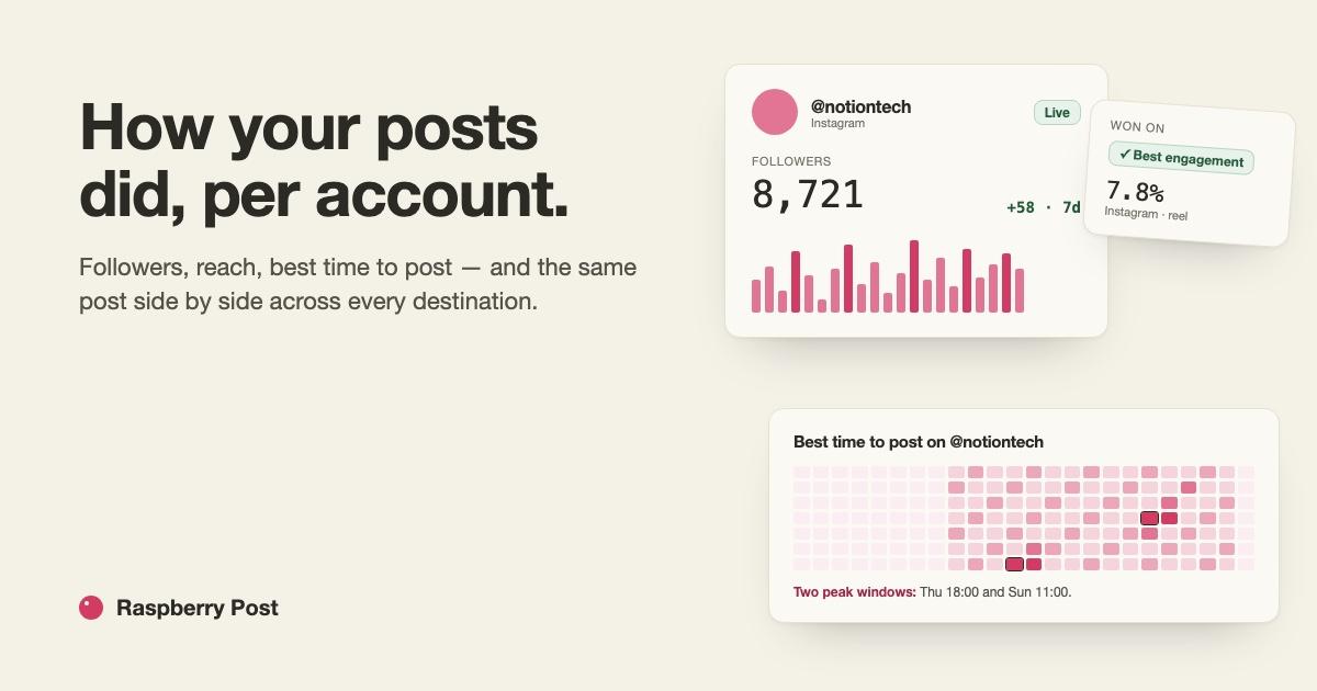
Until today the dashboard was a heading and a sentence. Now it answers the question every scheduler leaves you to work out yourself: did it work?
One card per account
The dashboard opens on a grid — one card per connected destination. Each card shows who follows it and how that moved this week, what the last post did, and what is queued next. If a credential has lapsed, the card says Reconnect instead of showing stale numbers.
Two accounts on the same platform are two cards. A podcast Instagram and a main Instagram are different audiences, and nothing here adds them together.
Each account, up close
Click a card and you get that account alone:
- Reach over the last thirty days, one bar a day, with the posts that cleared this account's own top tier in a deeper colour.
- Which format works here. Median engagement rate per format — reels against carousels against photos — with the sample size next to every bar, so you know how much to trust it.
- The best time to post here. A weekday-by-hour heatmap in your own timezone, with the peaks named in plain words. If your next scheduled post misses them, it says so.
- Recent posts in the platform's own columns. Saves on Instagram, reactions and clicks on Facebook, views on YouTube — not one table with dashes in half the cells.
Every one of these needs ten posts with numbers before it draws anything. Under that, it tells you it needs more rather than charting three points.
The same post, everywhere it went
This is the one place cross-platform numbers are honest, because the content is identical and only the audience differs. Send a post to three destinations and the dashboard lines them up side by side, each in its platform's language, with a badge on the one that led on reach and another on the one that led on engagement. A toggle switches between raw numbers and numbers per thousand followers — raw favours the biggest audience, per-thousand favours the one that actually responded.
Under the cards, a takeaway in plain English composed from the numbers on the page: what worked where, what fell short of that account's own median, and what to try next time.
Where the numbers come from
Each platform's own API, asked on a cadence: hourly in a post's first day, then every six hours, then daily until it is a month old. Account totals once a day. Nothing is estimated.
One honest gap: YouTube's average watch time lives behind an Analytics consent this app does not ask for yet, so that row says not available rather than showing a zero.
More Articles
Raspberry Post is live
One post, scheduled once, out to Instagram, Facebook Pages and YouTube — with your files staying in your own Drive.
August 30, 2026
What actually ranks — watch time, sends, likes
Instagram's own head named three signals. Follower count and posting streaks are not among them.
August 26, 2026